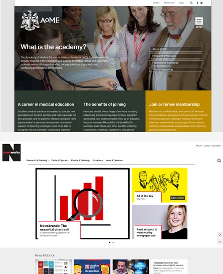
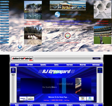
The homepage for any website is usually the most viewed and visited page and it’s your number one most crucial online tool for gaining members and inspiring your users to take action. 15 years ago when the world slowly migrated online it was a common practice to squish as much information as possible on to a homepage. It became a patchwork quilt of icons, logos and calls-to action; a jumble sale of items all jostling for attention and begging users to ‘click here’ or ‘join now’. But we're soon to welcome in 2017 and web users - no matter their hobby, profession, age or technical ability - are looking for something different.
17% of pageviews last less than 4 seconds.
Attention span statistics from www.statisticbrain.com
Despite what many experts say, your homepage is not a shop window, or a front door, or a welcome mat. It is not only the place from which your users will navigate; the commissionaire that will encourage them to contact you, to find out about you, to view what you have to offer and to join you. It is simply your chance to make a first impression, and since often it takes an internet user just 3 seconds to make up their mind on whether your site is useful or not, your homepage is the only opportunity you have to communicate who you are, what you do and why you are valuable to them.
Unfortunately websites and perhaps even marketing as a whole often seem to get forgotten by the membership, non-profit and charitable community; it’s often a case that limited budgets mean sites go without attention and are always put off ‘until next year’. However, as online trends and technology (such as Google’s latest update, Penguin 4) evolve so rapidly, one more year can mean you have an awful lot of catching up to do when you finally get around to it.
Let's take a look at what makes an effective, future proof website and what indicates it's time for an update.
The good
- Clear user journey
- Consistent, easy to read copy - just the right amount to hold a user's attention
- Clean, crisp photography and graphics
- Mobile responsive so can be viewed anywhere any time
- Eye-catching, captivating scrolling banners
- Obvious calls to action
- Fast, smooth loading time
- Information is easy to find, to give users the best experience so they return & recommend
The bad

- Busy background
- No obvious user-journey
- Writing style inconsistent
- Information hard to read and unintuitively placed on the page
- Outdated photography and graphics
- Photography inconsistent and placed randomly around the page
- Not mobile responsive - fits only to desktop screens
- No clear goals
- Enourmous photographs which can eat up data if viewed on a mobile
- Slow load time due to outdated technology
Don’t let your homepage fall by the way-side. The only good time to make a change and refresh a neglected website is right now. If you’re not quite achieving the goals you want to as an organisation, your site’s homepage is a great place to start. For inspiration take a look at our portfolio to see how we’ve helped organisations improve theirs, or contact us here at Senior Internet for more information.
View more like this: Making your renewals system work for you and your members